alt="\2"

The Extension to the Denver Art Museum, The Frederic C. Hamilton Building, is an expansion and addition to the existing museum, designed by the Italian Architect Gio Ponti, which opened in 1971.

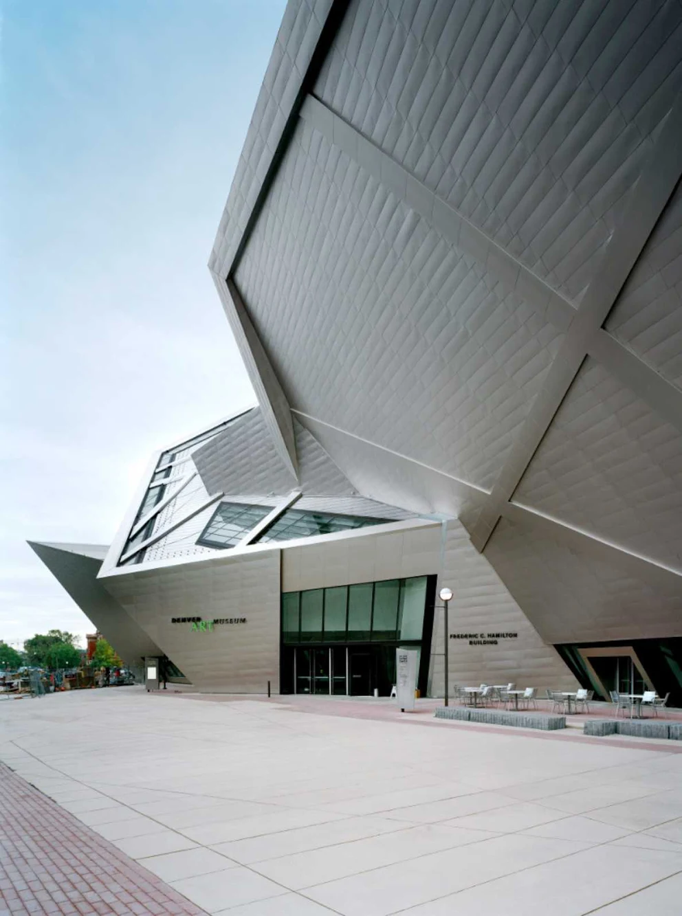
The 146,000-square-foot extension, which opened in October 2006,currently houses the Modern and Contemporary art collections as well as the collections of Oceanic and African Art.

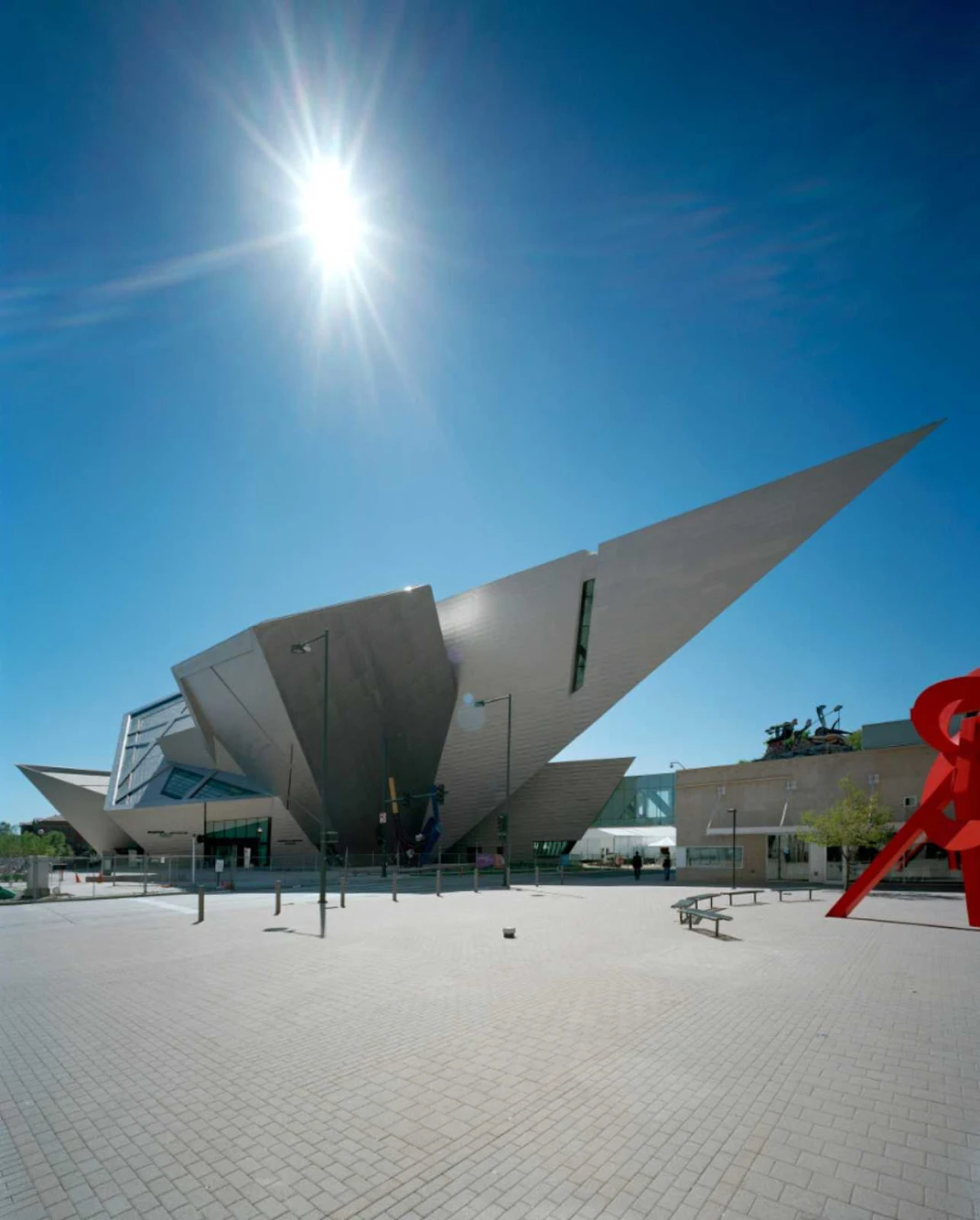
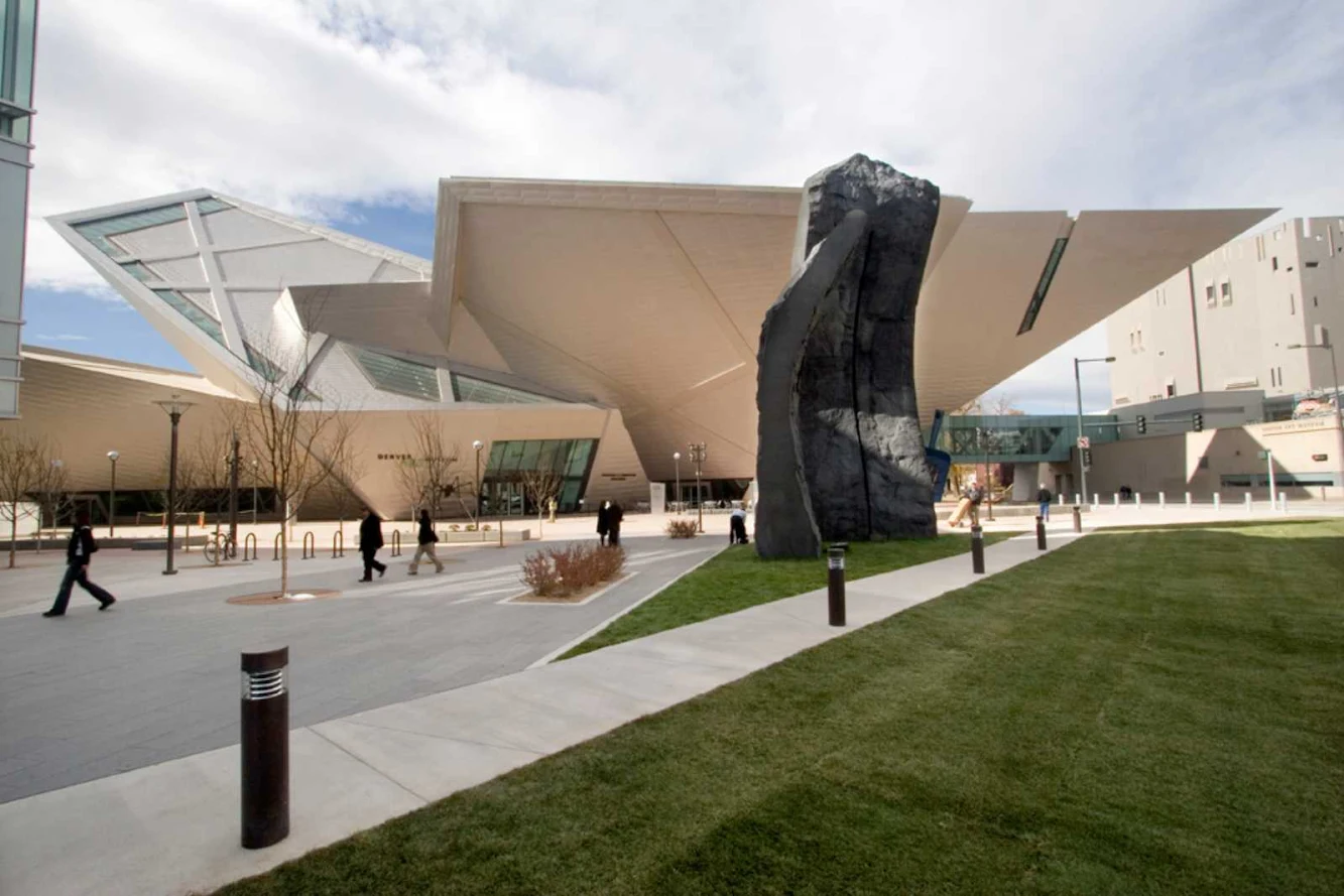
The Hamilton Building’s design recalls the peaks of the Rocky Mountains and geometric rock crystals found in the foothills near Denver. The materials of the building closely relate to the existing context as well as introducing innovative new materials, such as the 9,000 titanium panels which cover the building’s surface and reflect the brilliant Colorado sunlight.

The project is designed as part of a composition of public spaces, monuments and gateways in this developing part of the city, tying together downtown, the Civic Center, and forming a strong connection to the golden triangle neighborhood.

The Museum has dealt with the challenges of this space by using it to display contemporary sculpture; additionally, the Museum has used it to exhibit site-specific paintings by artists who enjoy creating work accommodated by these unorthodox volumes. The use of dynamically connected glass and titanium-clad triangular shapes is consistent with Libeskind’s vocabulary.

These shapes not only create an urban geometry that reaches into and reflects Colorado’s blue sky and help to unify the downtown area by complementing the surrounding architecture: the adjacent Michael Graves Denver Public Library and Libeskind’s own Museum Residences, which are across the plaza from the museum extension.

Daniel Libeskind described the inspiration for his design: “It’s so closely rooted in the history of the topography, the light, and the spirit of the city of Denver. Denver is a new city, Denver is an open city that gives you kind of a breathlessness when you come here. You see the world in a beautiful way, and that’s what the building mirrors: it mirrors that spirit. It comes from the excitement and the beauty of this place.”

“One of the challenges of building the Denver Art Museum was to work closely and respond to the extraordinary range of transformations in light, coloration, atmospheric effects, temperature and weather conditions unique to this City. I insisted these be integrated not only functionally and physically, but culturally and experientially for the benefit of the visitors’ experience.”

“The new building is not based on an idea of style or the rehashing of ready made ideas or external shape because its architecture does not separate the inside from the outside or provide a pretty facade behind which a typical experience exists; rather this architecture has an organic connection to the public at large and to those aspects of experience that are also intellectual, emotional, and sensual.

The integration of these dimensions for the enjoyment and edification of the public is achieved in a building that respects the hand crafted nature of architecture and its immediate communication from the hand, to the eye, to the mind. After all, the language of architecture beyond words themselves is the laughter of light, proportion and materiality.”


Location: Denver , Colorado, USA Architects: Studio Daniel Libeskind Structural Engineer: Arup (Los Angeles) Structural Connection Design: Structural Consultants, Inc. Mechanical Air: Arup-Los Angeles Mechanical/Electrical: MKK Engineers and Arup (Los Angeles) Structural Engineers: ARUP (Los Angeles) Structural Connection Design: Structural Consultants, Inc. Civil Engineers: JF Sato and Associates Interior Designers: Studio Daniel Libeskind with Davis Partnership Landscape Architects: Studio Daniel Libeskind with Davis Partnership Lighting Consultant: George Sexton and Associates Theater Consultant: Auerbach Pollock Friedlander Acoustical Consultant: ARUP (Los Angeles) Area: 146,000 sq ft Year: 2006 Photo: Bitter Bredt, DAM, SDL, Michele Nastasi